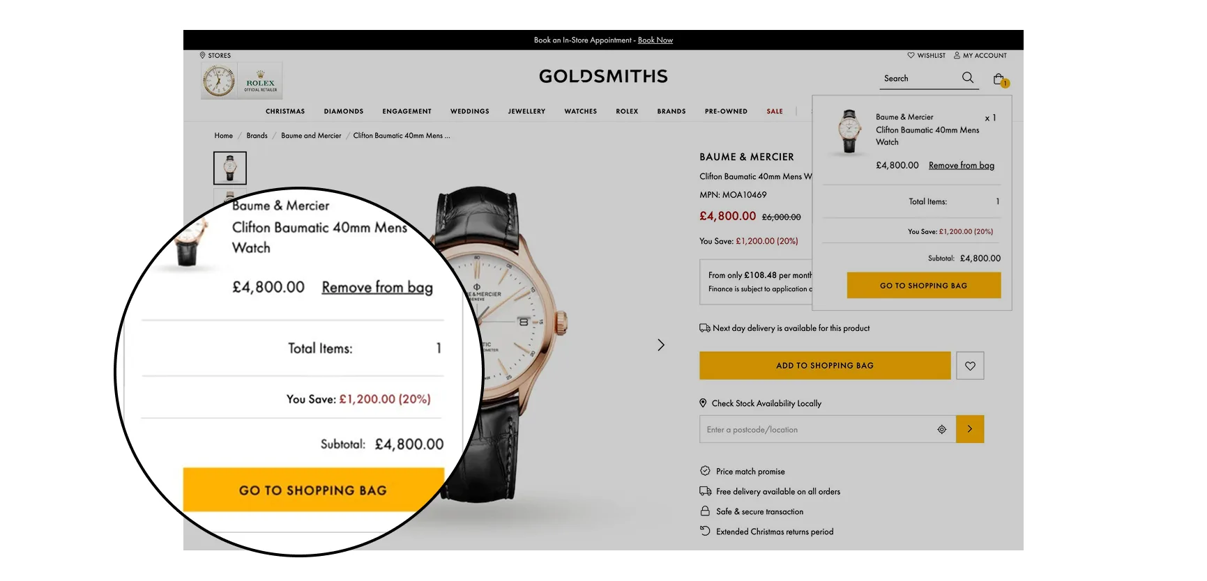
Displaying a percentage and monetary value saved on sale items
Industry
eCommerce
My role
UX/UI
Campaign duration
2nd July 2021 – 3rd August 2021 (28 days)
KPI
The success of this campaign was based on by measuring:
- Add to bag
- Conversion rate
I identified a problem within the sale category: users were not being clearly shown the value of their savings. I observed that this missed opportunity could be impacting add-to-bag rates. To address this, I proposed showcasing the percentage off and money saved, hoping that this would directly influence user behaviour by showing visible savings and increasing their likelihood to purchase.
The purpose
The purpose of this project was to address the identified issue of low add-to-bag rates within the sale category. By implementing a clear display of percentage off and monetary savings via a 33/33/33 A/B/C UX/UI test, I aimed to enhance the perceived value for users, ultimately driving an increase in purchase intent and conversion rates.
- Variant A — Default (no savings shown)
- Variant B — Savings shown in red font
- Variant C — Savings shown in black font
The outcome
The campaign was served to 212,884 sessions on desktop and mobile devices.
Variant B with the red font had a significant uplift in add to bag with a +4.26% increase.
Variant C with the black font had no impact when compared to the default.
There was also a -29.9% reduction in bounce rate on the PDP.
Variant B had a marginally significant uplift in revenue per session by 9.2%. This translated to a marginally significant +6.4% uplift in new user conversion.
Design
Desktop & mobile
The designs show the variants A (default) which is the default behavior. B (variant) which shows the savings values in red. C (variant) which shows the savings values in black.

Conclusion
Short summary
Displaying the percentage off and monetary value saved on sale products in a red font significantly increases add to bag rate.
Whilst variant C (black font) had no impact on users adding products to their bag, variant B (red font) significantly increased add to bag. I believed this could be due to the black font fading into the page with the other text, whereas the red colour matches the red sale price and would appear clearer on the page to the user by association.
If the winning variant B (red) was served to 100% of users I estimated that there would be an increase of 401 add to bags over 30 days. I then recommended serving this to 100% of applicable users.
Following the marginally significant uplift in new user conversion, I recommended expanding the visibility of savings throughout the main website touch points where product is shown and during the checkout funnel. I proposed adding the monetary savings amount at each step, believing this would further incentivise users and drive a measurable increase in checkout conversion.